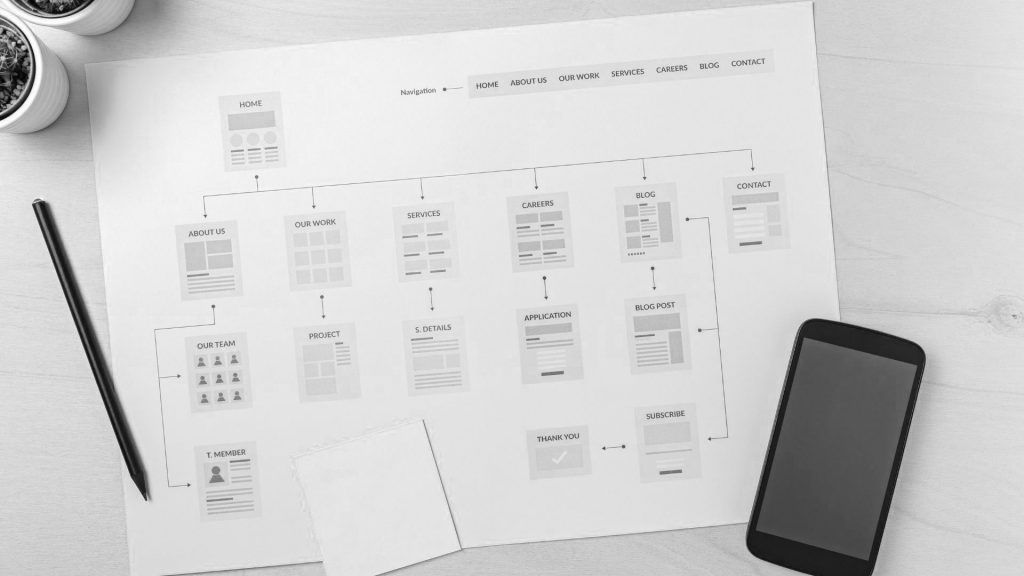
The navigation of your website is important for retaining viewers on your site. Keeping viewers engaged and ultimately driving them to conversion funnels is the key to a successful website. If the navigation is poor, frustrated viewers will get lost, together with potential sales!
User friendly websites will ensure lower bounce rates and increase conversion rates.
Global website navigation
Many websites are designed to incorporate global website navigation where the menus and links are identical across all the website pages. The header and footer information or menus are the same on each web page as well. This helps to keep the site easy to read and for potential customers to find what they are looking for.

Links
Internal links within the content are used for linking to other pages or products within the website. Talking ecommerce, if you are wanting to show various products within a category it would be necessary to create links with sub-menus for ease of use.
By including links to more content at the end of each piece that you create and adding a sidebar with suggested pages to the edge of your site, you will also improve the navigation of your website, resulting in longer site viewing and hopefully a higher conversion rate.
Floating heading menus
Menus that are created to be responsive and clear help to make the navigation of your website easier. A floating header menu is one that stays at the top of the web browser window as you may scroll down a page. It often includes a small logo and a search bar, enabling viewers to identify the company and make a quick search on any page. A floating header or footer menu will help make internal navigation of your website easier.
Design
The use of whitespace, colours and font differentiation helps with good navigation for the menus. An uncluttered page will be easier for a viewer to follow than a page which looks cluttered with too much information.
Planning for good website navigation
Plan the navigation of your website with your viewers in mind right from the inception. What would your viewers be looking for when landing on your website? Use simple, clear navigation to direct viewers and use words, phrases and terminology that they would be familiar with relative to your business. This will in turn help with the SEO aspect of your website.

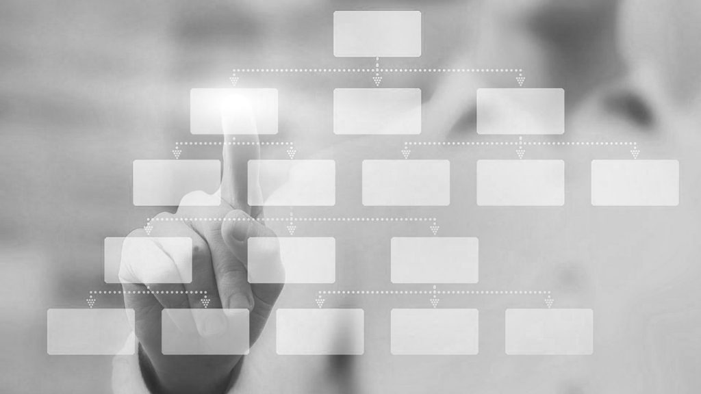
Hierarchy
The average time spent by a viewer on a web page is 20 seconds but ideally you would like someone to stay on your site for longer. This is done through increasing engagement. Arrange your website in a manner that allows viewers to naturally gravitate to the most important elements. Menus and navigation should always be click friendly links – don’t forget on mobile the clickable area will be much smaller than on desktop. If using symbols for navigation purposes, stick to the obvious and well known symbols eg. the looking glass for the search function.
Always keep in mind that your website may be accessed by various devices and needs to be mobile, laptop, tablet and PC compatible. Keep the navigation clear and simple to use on all devices. The best websites are easy to navigate and are often designed by an experienced web developer who understands the fundamentals of creating good navigation of your website.
