We are spending an increasing amount of time in the studio talking and thinking about ‘Content Strategy’. It is something we have always done, but only in the past few years has it become the driving force behind how we deliver our web services. A website without content is the same as a newspaper without copy… empty. A newspaper is a very simple idea. A printed, well-defined layout containing text and images that communicate information. There is not a huge amount of creative freedom in HOW the newspaper looks, any creativity needs to be defined by the content itself. An informative article, a poignant comic strip.
Let’s compare a newspaper to a poster. A poster (let’s say for an upcoming event) is equally informative and requires all of the necessary content to serve its purpose. However, a poster is not defined by a clear layout. Its content can be displayed in any manner of creative, interesting visual design. One thing you learn early on in Visual Communication is that the design should not get in the way of the content, it’s purpose is to help deliver it.
Websites are not newspapers nor posters. But what are they?
Good question. The web has gone through so many life cycles in its 25-year modern history. Starting out somewhat similar to a newspaper with columns, limited creative options and text-heavy. It has then morphed through the era of Flash, Web 2.0 and now the mobile revolution. At their core, like a poster or a newspaper, websites are a basic form of visual communication. The web’s difference though is that it is a constantly evolving medium and far too often the medium gets in the way of the message.

How many times have you felt completely lost reading a newspaper or looking at a movie poster? Why should the web be any different?
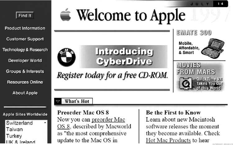
One of the issues with web design is that its early practitioners were not ‘designers’ at all but coders and tinkerers without any formal design training. This made sense at the time because the palette they had to work with was not much more than a very basic text editor. If you take a trip down memory lane and look at some of your favourite brand’s web presence in the 90’s you will be shocked at how basic and crude the ‘design’ is.
The content also suffered as no one was sure what the web was going to become or how to talk to these people logging on at Internet cafes around the world. Jump forward to 2020 though and we have a much more sophisticated user base and a range of tools that allows almost any design layout to be achieved.
So why are so many people getting it wrong?
Keeping a design simple is much harder than meets the eye. Stripping away the redundant and only revealing the core of your message is the key to a powerful design. (Think the Obama campaign). The web is a mess with redundancy. Poor typography, endlessly sliding banners, cliche stock images and hoards of copy just for the sake of having copy.
If your business sells pool supplies, what is the quickest, most direct means of telling me, your potential customer, why you are the best? Surely you don’t need a 10-page website that details the minutia of your trade? 30-second video with a well designed landing page might be all you need to get customers over the line. It will depend on how you are finding them (or them finding you), but a simple plan of attack is 95% of the time, the best plan.
Websites should be simple and to the point. The hard work goes in before we even start thinking about the actual design, things like:
- Defining your demographic
- Brand Strategy
- Photography
- Video content
- High quality, well-structured copy
Once you have those things in place our job as designers is simple and your website is going to do a brilliant job of communicating your message.
We love to chat strategy, so if you think your site could be simplified or is in need of a content overhaul, give us a shout!


